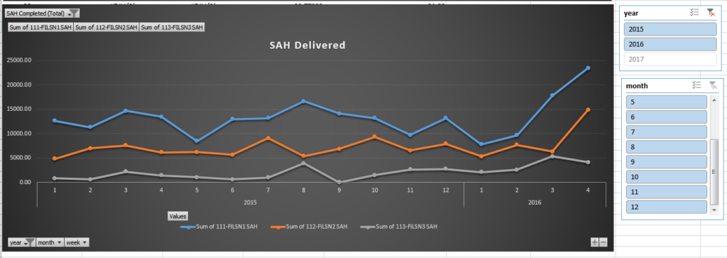
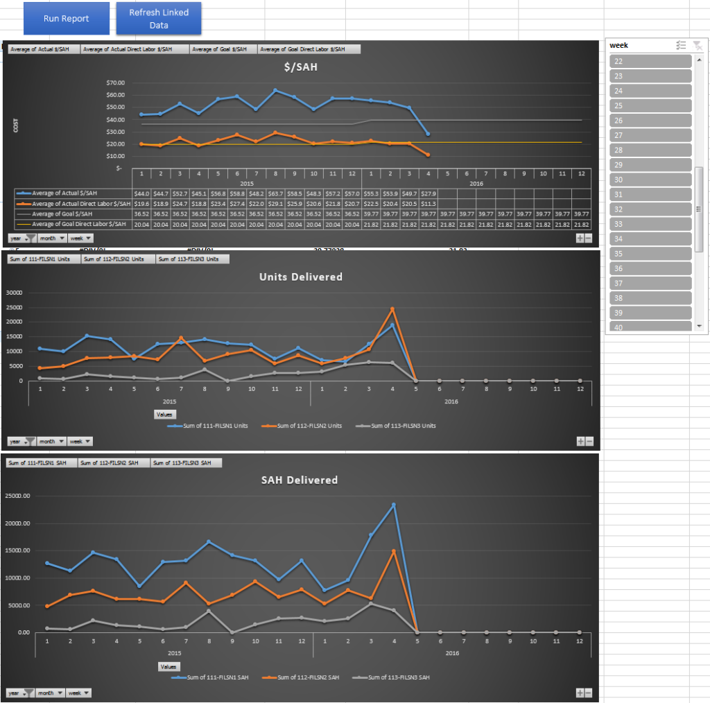
My work was having an issue rolling up and trending out some production and finance information related to output performance and cost, which was making it hard for them to see over a large period of time how they were performing to plan when it came to per unit cost and unit delivery goals. All the information needed for this existed already, but (and I’m sure this is a big but for a lot of businesses) the information resided in multiple locations and formats making it extremely time consuming to pull together into a cohesive format.
My goal for the dashboard was to create a single location where both the production and finance team could look at together to see how well the company is performing to plan on a weekly/monthly/quarterly basis.
The first part of this project was identifying what information is being used by the two departments:
Finance:
- Monthly overhead costs
- Direct labor cost broken out by factory
- Indirect labor cost broken out by factory
Production:
- Number of units completed by factory
- Number of standard allowed hours (SAH – how long it should take to complete a unit) completed by each factory
The second part was to find the overlapping information that both Production and Finance teams are measuring themselves against, which in our case was:
- $/unit
- $/SAH
- Direct Labor Cost / SAH – this shows how much money we end up spending on labor over a time period versus how long it should generally take to complete the labor
Once I had a chance to look through how the teams currently use and create the reports that are generated for Production and Finance teams, I start looking into where the information was being pulled from.
On the Production side, a new ERP system (Dynamics AX) has all of the information related to finished goods completed form each production location while Finance uses ADP to manage costs related to Production. My goal was to combine these two locations of information and minimize and changes required by the users in each department. In order to accomplish this task, I had to link into the workbook used by Finance to track biweekly spending and pull information for the transaction log in AX. After getting the data pulled into a single location, I needed to change it into a usable format. I accomplished by creating three separate tables:
Financial table
- rolled up all of the direct and indirect labor between all factories
- tied in overhead costs
- added 10% payroll tax adder
Production table
- rolled up daily output into weeks due to all finical data only having visibility down to the week
- pulled in SAH information for the styles being made in each factory
- Rolled up total production unit output and SAH output
Combined table
- This table houses the calculations to show $/SAH and $/Unit on a weekly basis
I created Pivot charts off of the Combined table to show the performance overtime and created two macros to pull the information, refresh the tables, and validate against double counting of unit output.
Attached is an example with some salted data sets the pretty closely represents what we ended up using at filson.
-jess


