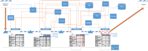
The ultimate goal of a current state value stream map(VSM) is to create a visual representation of how the value object flows through a system in, it should be pretty obvious, its current state. This visual representation should be able to help you visualize where in the process a bottleneck/issue are occurring. The problem is how do you show a current state VSM and what areas are having issues to a person or group who have never seen a VSM? They can be easily overwhelmed by the amount of information being displayed on a VSM and potentially get caught up on other details instead of what they should be focused on, like what are the current areas of opportunity within the value stream. Here’s an example of what a complete current state VSM can look like: : If you’re reading this, you can probably tell where the main issues are occurring, but for someone new, this looks like a complete overwhelming mess so let’s make this more consumable.
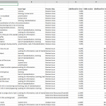
The first thing we need to do is add all of the pain points into from the VSM into an excel sheet and separate them so there is a single pain point per row. Next, we need to type the name of the process step the painpoint relates to in column b.
At this you point you can continue on using only the paint points count to produce the graphs or, if you begin to notice that a lot of the pain points have several issues associated with them, you can break these pain points down into the different issue “buckets” – this can become more of a qualitative art than data science since though so sticking with the defined pain points might be the best bet.
Once you have the pain points and process steps placed in the columns, the next step is to attach a few more elements to the process steps (quality, cycle time, inventory, etc). In the example I have added in the quality comparison (likelihood for error observed vs defined in the VSM session) each process step has a quality number attached to it so in the column next to process step, place the quality number for the associated process step. The quality number will be repeated multiple time like so:: example:: don’t worry, this wont be counted in the graph, it just makes it easier to create a pivot chart. Here is an example of what a completed excel data sheet will look like:
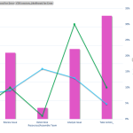
Once you have the data setup, highlight the data and add in a pivot chart. Once the pivot chart has been added, drop the process steps feild choice into the “Axis” category. Next, add in Issue Type, Observation – Likelihood for Error, and VSM session – Likelihood for Error into the “Values” section of the pivot chart fields. We want the Issue Type to be a count and the Observation data to be an average. The next step is to add in a secondary axis in order to scale the likelihood for error data against the count of Issue types. Once you complete those steps, your graph should look like the below:

The graph above makes it much more evident where the bottlenecks or issues are occurring and should be much more consumable for your customer who need to view the information from the VSM.